


TABLE OF CONTENTS
Guidelines and Techniques for Responsive Web Design
Websites only opened on personal computers’ — PC, monitor screens in the early days of the internet. As computers evolved, devices now have a range of screen sizes from cellular devices and palmtops, to wearables and laptops: you see tiny smart screens and huge LED. Providing an astounding user experience on websites no matter what the device size is, shows development success, and that’s where the need for responsive web design or RWD jumps in.
According to Statista, more or less half of the worldwide web traffic goes through cellular technology: i.e., mobile devices generated 50.81% of website traffic globally by the end of 2020. This implies that every business should focus on responsive web design development to target mobile device audiences.
But, before developing a responsive web design, let's discuss what it is.
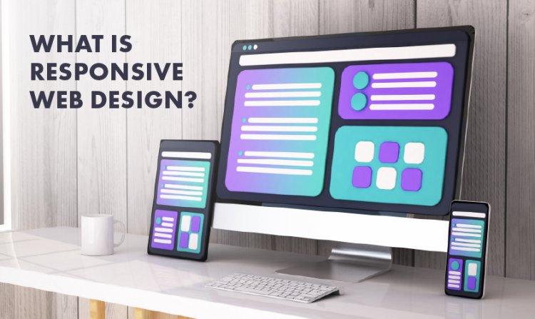
What Is Responsive Web Design?
RWD responds according to the user’s device screens and even to the user’s needs. The website layout changes according to screen size and device capabilities. If content appears as one column on a mobile screen, it may be displayed in two columns on monitors. RWD can provide a seamless user experience on mobiles, tablets, monitors, smart LEDs, gaming consoles, and even wearable devices.
A modern RWD considers various factors to optimize the user experience: including screen sizes, device features, device technology, etc.
Principles of responsive web design
Responsive design is dependent on three main principles, though there may be various others that play a vital role. The following are three Responsive design principles that we think are pretty important:
- Fluid Grid Systems — this is a layout building practice that allows your web design to be incorporated into adjustable grids that resize according to screens.
- Flexible Images — this deals with the scalability of images and media that change according to the user's viewport or user's visible web page.
- Media Queries — these let your website designs change according to the browser window size.
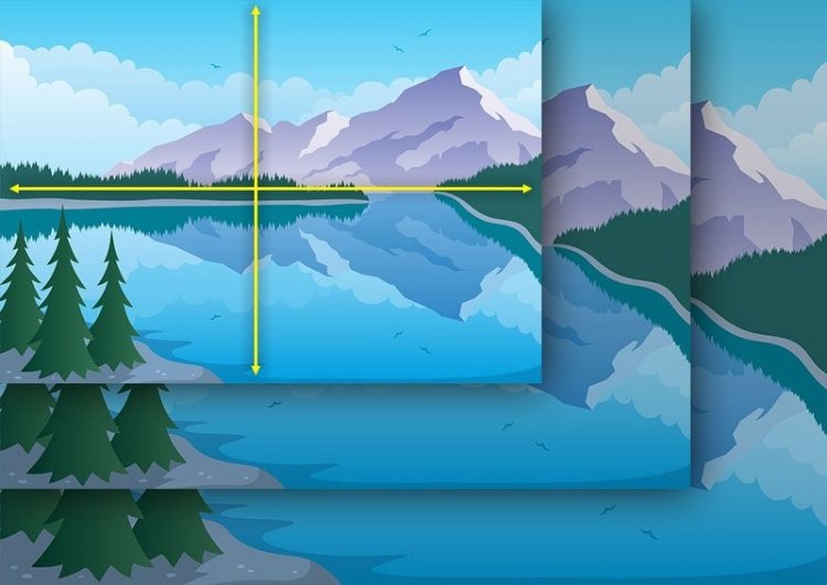
Fluid grid system
Websites of yore used the print media template for content publishing. Content was displayed in columns and positioned in an absolute position and size according to pixel positioning. However mobile devices helped revolutionize this practice, and now various resolution patterns are accommodated using relative percentages.
Absolute size will not work for RWD. So, relative sizes are used to create flexible grids according to the following mathematical formula.
Relative size percentage = target size / display context multipli*ed by 100,
For instance, you’re developing a website with a layout of 1000 pixels but the device uses a browser with a window width of 1300 pixels. If 1000 pixels is the size we are targeting, and 1300 is our display context.
1000/1300 x 100 = 76%
76% will be our relative size of layout design.
This formula is applied to design every element in your web design layout: text and font size, column width, length, and margins. By constructing them on a specific percentage using this formula, you can turn a fixed size into a relative size responsive to any screen. The fluid grid system also relies on CSS. You have to apply these percentages in CSS to develop RWD.
Flexible images and media
Besides flexible web layout, images and media should also be responsive according to screen size. This principle lets pictures and media load in different resolutions according to varying screen sizes. Flexible images and media integration is possible by scaling and cropping in CSS.
CSS command img { max-width: 100%;} can be used to direct the browser to shrink the image to max 100% and scale to its container accordingly. It will prevent the image from stretching even if the container size varies.
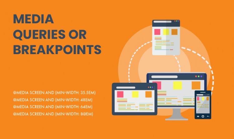
Media queries or breakpoints
CSS media queries are responsible for altering the website's layout according to the screen. The website inspects the device type, such as its resolution or viewport to display the content accurately. CSS Media Queries determine the width, height, aspect ratio, and even orientation of the device.
Responsive web design CSS Media queries have two components, i.e., the type of media (screen), and the actual query regarding the media features to inspect, and target value.
Responsive web applications are best when you want to provide users with easy accessibility. If you need to develop your website with responsive design, you can surely reach out to Appedology, an app development company. We have an expert team dedicated to incorporate the latest technological trend in web development, mobile app development, and various other digital solutions.
Tips for Responsive Web Design Development
Developing responsive web design is easy, and one can master it by following these tips:
Plan RWD Strategies
A good plan for a project is the main element of success. Proper planning is crucial for developing a good RWD. Your website will not be user-friendly if you don't plan every RWD element with attention and care.
Keep in mind these few things before your plan your RWD:
- Prioritize and sequence product feature-based content.
- Keep target audiences in mind when creating UI design.
- Brainstorm and analyze to decide what will work and what will not.
- Make use of appropriate icons where necessary.
- Keep button sizes large.
- Pay attention to A/B testing.
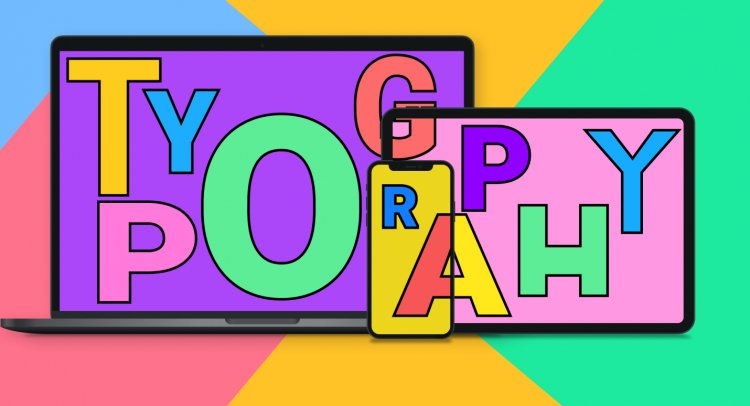
Be Attentive Towards Typography
Typography is the foundation of your website's design and content. Your visitors notice content layout instinctively because that is what they are looking at constantly. Therefore, your typography must also be responsive according to the resolutions of screens and devices.
- Never use dummy content for your website for testing purposes. Determining whether your actual text will appear in the same way as “Lorem Ipsum” is difficult to test: your content may appear worse when finally added, this is because without a visual check you cannot judge whether your content is ready for publishing or not.
- A responsive website uses responsive font: keep typography size proportional to container width, so that it is adaptable to client's screens. Avoid using pixels if you can, as they come with fixed size dimensions.
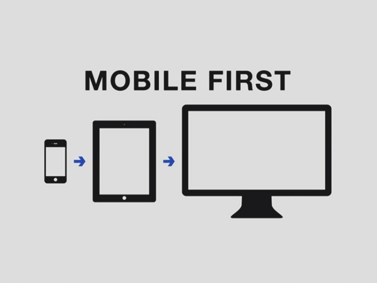
Start with the smallest viewport — take a mobile-first approach
Start developing responsive web design from the mobile layout. It's better to start with the smallest viewport as adding features to bigger dimensions is easier than removing features from smaller spaces. The Mobile-first approach of web design lets you design a mobile website initially, and you can work on the desktop version later on for the following reasons:
- Due to a variance in screen sizes, mobile websites create more issues for user experience. So it is important to focus primarily on mobile web design.
- Scaling down a desktop version of web design is difficult, whereas scaling up a mobile version is easier because you can get more screen space on the desktop.
- You can choose to evaluate what is necessary functionally and visually through the mobile-first approach of RWD.
- Also, you can focus more on content rather than design through the mobile-first approach of RWD.
Remember mouse cursers and touch screens are important too
A responsive web design should have interactive elements according to the medium type. A desktop screen user will interact through a mouse cursor, while a mobile or tab user will use thumbs or fingers, it only makes sense to optimize the responsive design for touch screens
- Avoid on-hover states for mobile web design as they respond to cursers, not fingers.
- Increase the size of your interactive elements and use white space for clear visibility.
- For desktops, the main navigation should be at the top and for cellular devices, navigation should be at the bottom so that users can tap through their thumbs easily.
Conclusion
Developing responsive website design is now a compulsion for most app owners and businesses. These guidelines and techniques for responsive web designing will help make your website reactive and adaptable to different screen sizes and create higher periods of customer engagement, plus strong brand following and customer loyalty. If you want a responsive web application for your business, contact Appedology. We are an app development company in Corona, California, providing exceptional development and design services to businesses. Reach out to us anytime for free consultancy and let us help you bring the elements you need in RWD accurate so you can begin to enjoy the benefits of customer engagement.

?")


let’s get started!
Get in touch today. We’re ready!