TABLE OF CONTENTS
Best Abstract Logo Design Ideas for Companies
If an image equates a thousand words: why use abstract images? Surely a designer should tiptoe past distorted lines and barely recognizable shapes. Why use a geometric shape if you can easily employ an easily associable image? The reasoning behind this is actually quite intelligent. What would you choose to see as a logo for a company that promises to deliver happiness? A literal happy face or clown or any such image, or the subliminal use of bright colors associated with happiness? Which would instill brand credibility? Abstract images impact viewers longer as the mind works to decipher them, and that is why abstract logo design is the choice for most brands and companies. Expressing concepts through a symbol is an artistic science.
Here are some great abstract logo design ideas for companies.
Types of Abstract Logo Design
There are many ideas for abstract logo designs, but you shouldn’t try to include everything you come across in one image. If you want your image to make a long-lasting impact on the masses, it should be simple, yet unique. Abstract logos are used worldwide because they have the characteristic of elevating a company with an elegant persona. Let's discuss the design types of abstract logos you will come across.
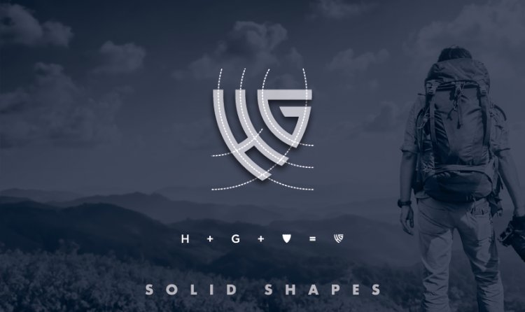
Solid Shapes
Abstract solid shapes are simple and great for communicating a clear, intuitive message: plus they are easy to remember. A strategic designer would think of employing these to create a logo that people can recognize almost immediately. It is pretty difficult to mistake a distinct solid shape even at a glance, hence helping customers retain and recall your brand image.

Do remember to play around with the shape, using a simple circle, square or octagon is boring, distorting and adding layers is what makes is distinguishable from others. Any company that wants to reflect their precision and accuracy should opt for a logo depicting a solid shape, and highlight it through monochromatic color schemes or backgrounds.
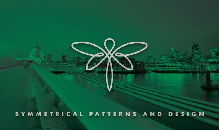
Symmetrical Patterns and design
All around us in nature we find symmetry in shape, color or both. Hence our eyes are accustomed to looking for symmetry in all things: think the golden ratio! Symmetry links to perfection and a brand that wants its tagline or vision to be centered on wellness and well-being would go for a symmetrical image.
Your symmetrical logo invokes a sense of balance. Using earthy, wooden or muted colors enhances the groundwork of your intuitive design. A study conducted by Harvard Business Review found that 95% of 423 major brands studied used symmetry in their design. You want your brand to depict stability, balance, and dependability? Think symmetrical.

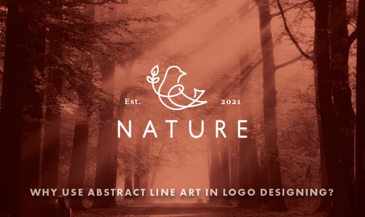
Why use Abstract Line Art in Logo Designing?
The line, whether straight or curved is one of the most fundamental elements of writing and art. Line art or line drawings are images made of well-defined straight or curved lines usually placed against a plain background, without shifts in shade or color to depict two-dimensional or three-dimensional objects.
Though it sounds contradictory using abstract lines or depictions convey emotions, thoughts, and feelings better than an actual image would. Remember the example of the picture of a clown vs using happy color to show joy? Since every detail, line and color add to or detract from the concept you want to project, choosing each element mindfully makes your work as a designer difficult but rewarding too when your customer gets the ROIs they were waiting for, simply because of your designs.

Using abstract lines to deliver your concept is using your creativity to show the world a different perspective on regular, boring everyday objects. As a designer you get to alter reality and change the way an image, animal or person looks; yet still keep it recognizable. An abstract image should not leave a viewer confused hence there are often discernible factors involved in creating such imagery, but the result is always stronger than a regular picture because of the distinct look. .
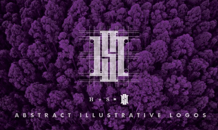
Abstract illustrative logos
Illustrative logos may have several complex design elements, often illustrating some element of what a company does, maybe an illustration of the company name or even a character or mascot used to represent the company. These complex designs subtly help in persuading people to think about your brand.
Since illustrative logos are so elaborate, they are harder to design. Illustrative logos can be very impactful and are great at creating brand recall – of course this does depend on brand type, market segment, and your target audience. You can use any abstract illustration that compels people to think about why you have designed this type of logo for your business.

Not all companies can afford to get an illustrative logo because of the complex work involved in designing them. Also, if your logo is to be used as corporate stationery, marketing collateral, signage, and perhaps on packaging and merchandise getting an expensive illustrative abstract logo will fall expensive. A better target market for employing these logos would be fitness, music, or construction companies, rock bands, child-related products or club that benefit from illustrative logos.
Multiple abstract design logos
There are endless options to design this type of logo, involving multiple designs to create a single strong image or mingling abstract lines with symmetrical art, shapes with illustrations. It helps you create a complex, impressive, and elegant brand image that can interconnect several stories simultaneously.
Conclusion
Whether you choose to use any of the above abstract design ideas to create a company logo by incorporating texts, a medley of colors, shapes, or illustrations, or go completely out-of-the-box and do whatever you can to manipulate images and create a create logo, this much is true: you can dramatically enhance your business or company image by designing an abstract logo.


let’s get started!
Get in touch today. We’re ready!